Archive for July, 2011


10 Rules of Automated Attendants (Part 3 of 10)

Guiding or ordering? Which one are you doing in your Auto-Attendant? People want to be drawn in, not ordered around. After all, the reason you have an Auto-Attendant is to give your callers options…which by very definition means they are free to choose what they would like.

But often a company’s Auto-Attendant will designed in such a way that it sounds like it graduated from drill sergeant school, and is eager to make it’s mark on the “new recruits” (also known as “your callers”!)

Here’s what Melanie Polkosky has to say in her 3rd Rule of Auto Attendant design (From “The Hooptedoodle of Phone“):

3. Never order a customer to do anything: Directives are the mark of customer service overstepping its bounds. Requests cloaked in the language of demands do not endear themselves to the customer; in contrast, they are an invitation to seek a new provider. The designer is sticking his nose in, as if he has a power he does not possess.

There’s at least two aspects in which this can happen.

The first is probably the most obvious…how the script is written. What words you use, and the order you use them in, to let callers know what options they can choose. Companies can get over-zealous in funneling their callers to where the company wants them to go, and in doing so, the wording becomes very forceful.

The second way is a little more subtle…how the script is voiced. How the voice talent reads the script, and applies their inflection to the message has a lot to do with how people perceive it. Is it warm and inviting? Cold and calculating? Some guidance to the voice talent on this is critical to keep the sound of the message inline with what will be well received by your callers.


10 Rules of Automated Attendants (Part 2 of 10)

What’s more confusing…a poorly designed Auto-Attendant that leaves you to flounder around all by yourself, or one that is so poorly designed that the creator chooses to put roadsigns and instructions for how to navigate?

In this Part 2 of 10 in our series of posts looking at good Auto-Attendant design, we’ll explore that very question.

Melanie Polkosky‘s advice for this 2nd point is excellent! (From “The Hooptedoodle of Phone“)

2. Avoid verbal landmarks: They are annoying. People lack the energy or desire to simultaneously re-create a flowchart in their minds while marching through a phone system. The dialogue itself should get them where they need to go; if you need to create signs to get around, then your tree has become a forest, and you should expect people to get lost.

The visual flowchart that represents your Auto-Attendant design should look a lot more complex than your message sounds once it’s implemented.

Not quite sure what I’m talking about? Here’s an example of verbal landmarks:
“Main Menu…For Service, press 1, for Sales, press 2…”
“Service Menu…to make a service appointment, press 1. To check the status of a service, press 2…”
“Service Status Menu…enter your 34 digit service request code…”
…and so on.

People know what they just heard that made them select that option, and they don’t need it to be repeated or even confirmed. We’re smarter than that! If you press 1 for service, you don’t need it to confirm that you went to the Service menu. It simply takes more time, and makes it a more frustrating experience!

I believe this type of design stems from designing “on paper” rather than “on the phone”. In other words, when you’re deep into an Auto-Attendant or IVR design, it’s easy to forget what it actually sounds like. You’re looking at one box on a flowchart, and it seems that the text isn’t stating what location it is, but in reality, if you follow the call flow on the phone, it makes perfect sense!

So don’t use Verbal Landmarks in your Auto-Attendant. If you have them, remove them. It will streamline your greeting…allowing callers to get in, accomplish what they want, and get out, without adding frustrations!


QR codes and your marketing

qrcode

This may strike you as way off the normal “Caller Experience” blog, and well, I’d have to agree.
But I had a couple of experiences with QR codes lately, and I wanted to share these with you.
Recently I was asked:
Chester,
You are very techy and try to implement good new technology…what is your take on QR Codes?
With QR codes, there are a couple of things to think about.
Number 1 thing: Some times people forget that a QR code will viewed on a mobile handset. But in forgetting that, they send the QR code link to a location that would be more suited for desktop browsing. (the only exception to that thought that I know of is that the iPad 2 can scan QR codes)
So if you’re picturing putting one on your business card, for instance, think carefully about where that link should send the viewer. Sending mobile browser users to your main “desktop” website home page probably isn’t going to provide them any value.
Sending them to a special mobile version of your contact page, that allows them to import your contact information into their phone in one click would be extremely valueable!
QR codes aren’t “magic sauce”, they’re simply another tool that I believe will become more prevelant and understood.
And along the way, we’ll run into some really terrible uses that people come up with! Like the mailer I got yesterday from a car dealer. The QR code was supposed to go to http://cardealer’swebsite.com, but instead it went to http://cardealerswebsite/.
Without the “.com” on the end, that’s a mal-formed URL, and when you scan the QR code, you either get a Page Cannot Be Found error, or a search engine result trying to find cardealer’swebsite! A terrible, terrible QR code implementation!
And secondly, why, oh WHY would I want to browse the regular “desktop” version of their website on my mobile phone? It could have taken me to some specific landing page that tied in with the contest mailer they sent, instead of dumping me off into never-never land of their home page, hoping I’d be interested in finding my way around their site on my mobile phone!)
Ok, here’s another example: (hopefully a good one this time!)
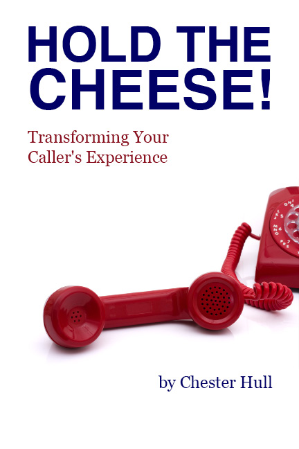
I’m writing a book about the Caller Experience. And while I’ll probably publish it as an e-book, I also think there is something of value by publishing an actual bound book.  The thing is, a lot of the examples I write about in the book are audio or video clips that I want people to hear or watch!
So, whenever I write about an audio or video clip, I put a QR code right there in the book beside what I’m talking about. Readers can whip out there mobile phone, scan the QR, and it will automatically playing the audio or video right on their smart phone! (they don’t even have to click a button…it just starts playing!)
As the reader is holding the book, reading that information, and I’ve made it interactive by using QR codes! (And, I personally think it’s a pretty neat way to use QR codes!)

With QR codes, as with any other customer interaction, a little bit of thought, from the customer’s perspective, is what’s critical to either success or failure!


10 Rules of Automated Attendants (part 1 of 10)

Have you ever wondered who thought of writing the Auto-Attendant you are listening to when you call a company?

How many times have you been frustrated by the options?

How often have you thought “they sure weren’t thinking of me when they designed this thing?”

One of the things that has always puzzled me is the fact that there seems to be an unspoken rule that Auto-Attendant messages have to be frustrating! I mean, that’s the majority of experiences out there, right?

Well guess what…we’ve done the research, and there is no such rule. Not a one!

In fact, just the opposite. The same rules that apply to good writing, also apply to crafting a good Auto-Attendant, and giving your callers a great Caller Experience.

Recently Melanie Polkosky wrote an article where she applies the top 10 rules of good writing to Auto-Attendant scripting.

Today I’m starting a series covering each of these rules in detail. But first let’s see what Melanie has to say:

1. Never open with platitudes: It only signals antagonism for the listener to utter something as trite as, Please listen carefully as our options have changed. The listener is more apt to roll his eyes in exasperation and stop listening altogether. It creates atmosphere for your interaction, no more positive than a book that begins, “It was a dark and stormy night.”

Have you ever been calling a company for years, and heard this same message for years? Of course you have! But it’s rather insulting to your caller. As if they WEREN’T listening carefully? “Listen carefully” as opposed to just doodling while I am talking?

It’s ok to change the options. But do you think callers really have memorized your phone tree options?

You might say “but our callers are power users. They know exactly what they want, and jump to that option without hearing the message.”

But think about it for a minute. Your power users  aren’t going to listen to it because they’re going to just jump ahead like they always do. And if they do get to the wrong menu, they know how to back up (you do have the “*” key as your universal “Go Back” key, right?), and they’ll listen to the menu.

But the callers who are not power users don’t need to know that the menu has changed!

Just leave it off the greeting, and you’ll have a more simple, brief, and pleasing main greeting!


Interviewed by Dave Young of BrandingBlog fame

Dave Young of BrandingBlog asked if he could interview me for his BrandingBlog Radio series, and the interview just went “live” at his blog.

Dave is a partner at the Wizard of Ads marketing firm. He really knows marketing strategy inside and out, and focuses on helping small to medium businesses grow their market share exponentially. (He’s also a Google Analytics genius!)

You can tune into the interview on Dave’s blog, at http://www.brandingblog.com/2011/07/brandingblog-radio-on-hold-messages-with-chester-hull-of-prosoundusa/

I was delighted to talk with Dave, and discuss some of the ways Prosound is helping businesses transform their Caller Experience.

Listen to the podcast from BrandingBlog.com, or subscribe in iTunes.